Before and After
Click and drag on white slider to see the full before/after transformation.
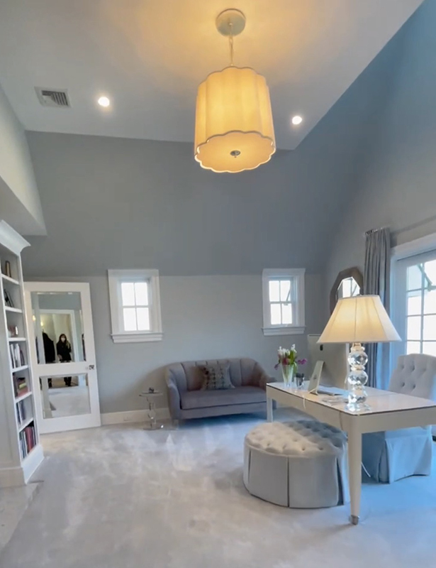
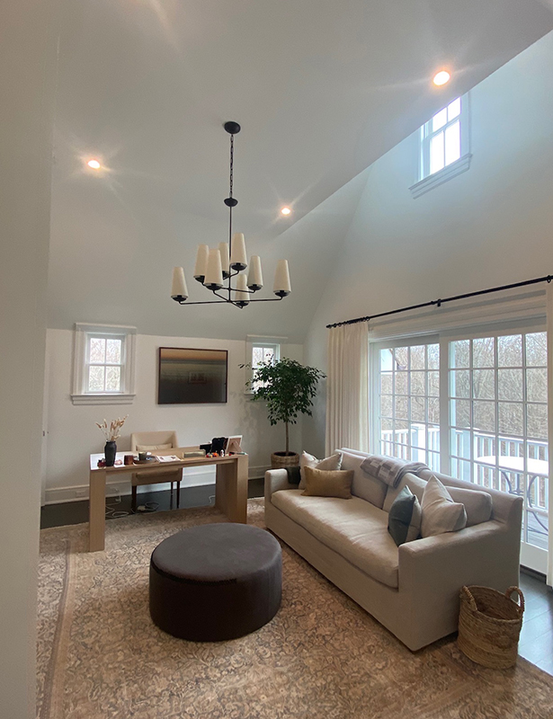
Greenwich home office remodel.
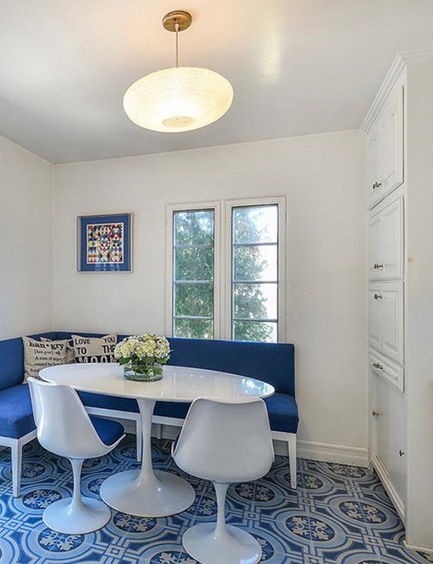
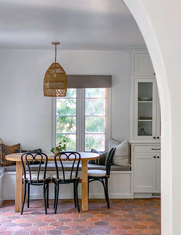
We gutted the kitchen, creating an eating area with a custom-built banquet, china cabinet, and table, with mid-century European cafe chairs, reinforced and refinished. Beautiful hand selected Arto Tiles (ordered through Classic Tile) evokes a warm, cozy vibe. Pillows are made from vintage textiles. The hanging basket light from Serena and Lily was hand-stained to subtly age it to relate to the space. Outdoor linen was used for the window shade and seat covers for added durability.
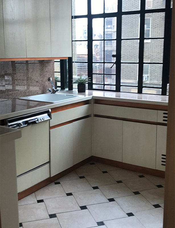
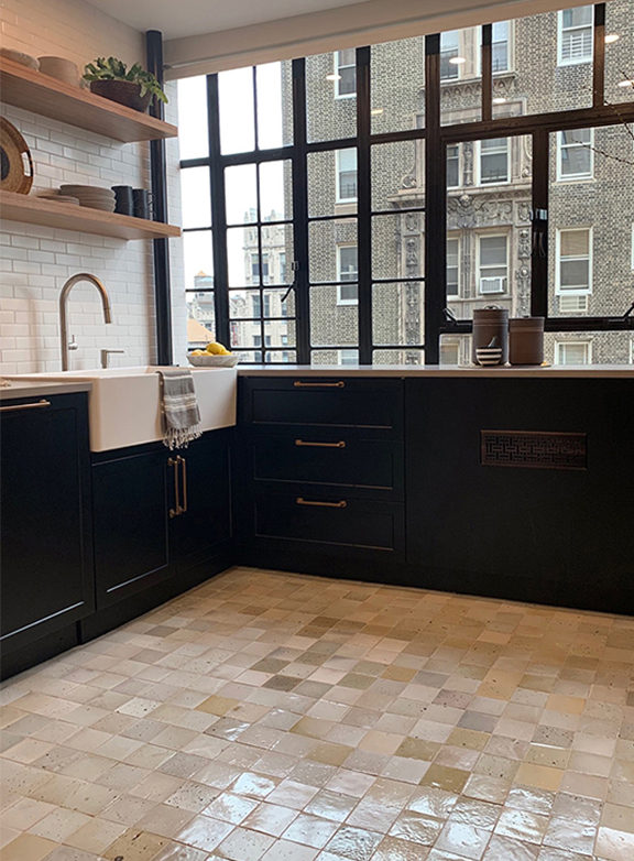
The only thing we kept in this room was the original metal windows. Cabinets and open shelves from Semi-Handmade Cabinets brought us in under-budget. Moroccan tiles, typically used as a back-splash, create a beautiful quilt-like effect on the floor. An ode to NYC, we created the back-splash with hand-cut subway tiles from Ann Sacks. The sink, an item from the clients’ wish list, elevated the space in a wonderfully unexpected way and is quite possibly the only “farm” sink on Central Park West.
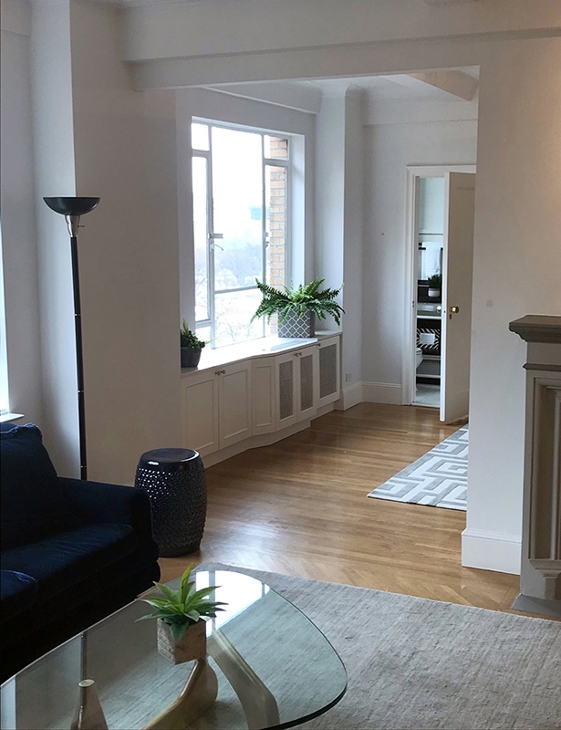
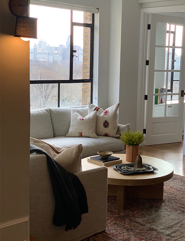
French doors add a touch of old Parisian charm, creating a den without closing off the room. Natural light permeates the space, making it calming, yet energizing, and an emphasis on neutrality ensures a timeless aesthetic that our client will enjoy for not just years, but decades to come.
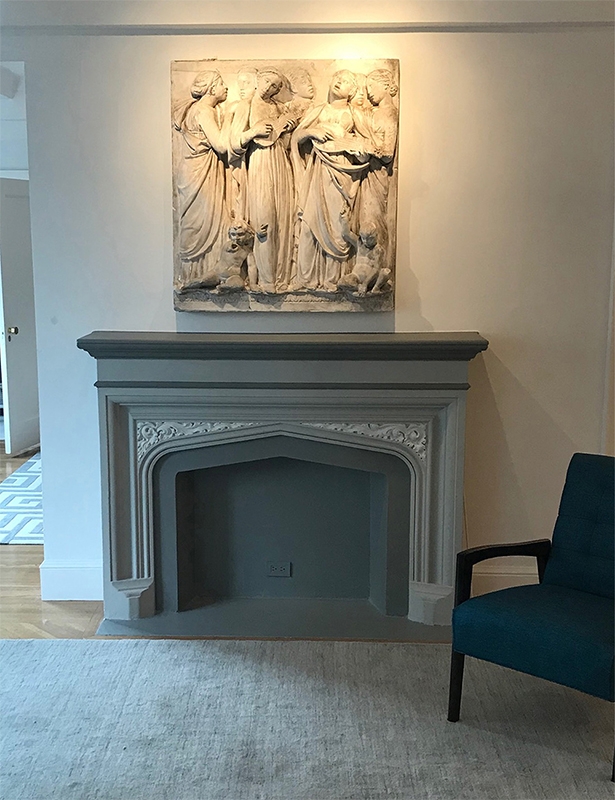
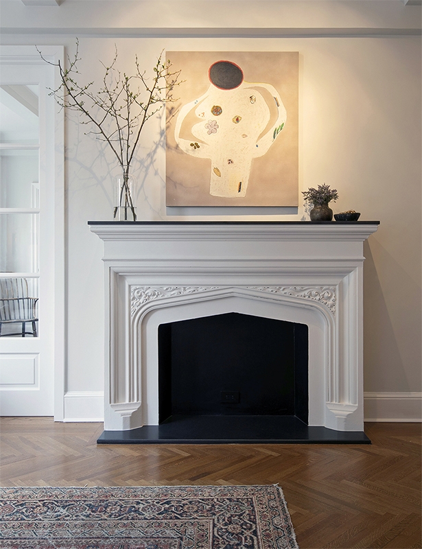
We refreshed the original plaster fireplace with a clean new color scheme and black marble top. Contemporary art from Art House LA , greenery, and a vintage rug completed the restyling.
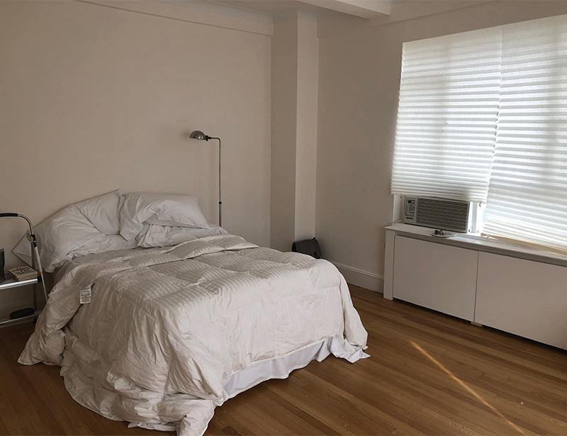
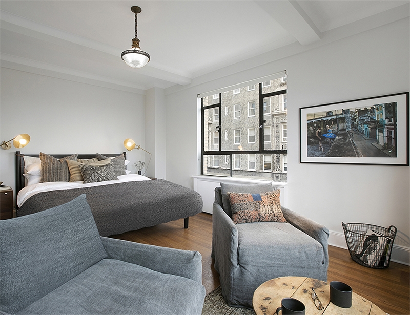
A contemporary bed and lighting from Shoppe Amber Interiors are paired with midcentury nightstands from 1st Dibs. A vintage French wine-tasting table and cozy washable linen slipcovered armchairs from Shoppe Amber Interior create a new bedroom sitting area facing Central Park. Clients wanted minimal window treatment, so simple roll shades were added for privacy. Photography is from the clients’ own collection.
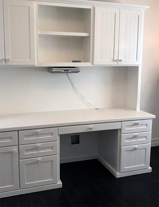
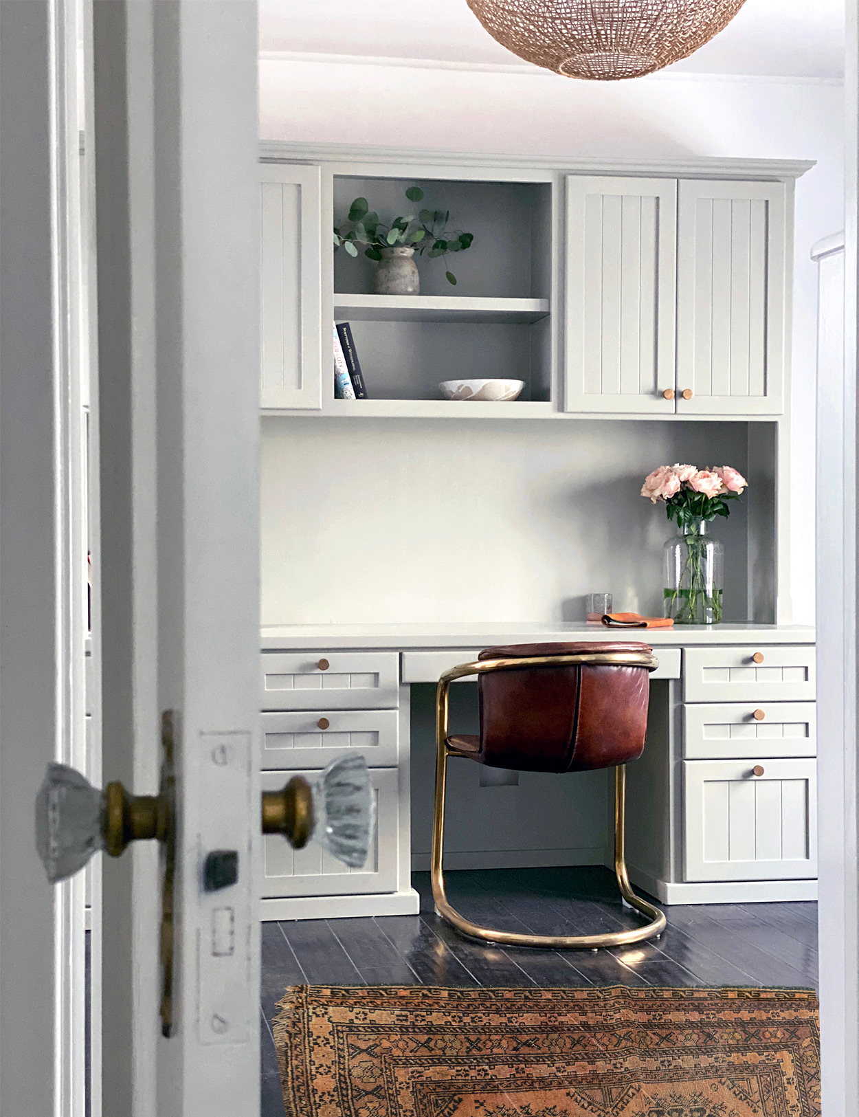
The oversized desk was left behind by previous owners, we repainted it and added brass knobs from Ashley Norton. A chair from Big Daddy Antiques, an eye-catching, affordable hanging light from LeeAnn Ford for Target, and a vintage rug complete this organic modern space.
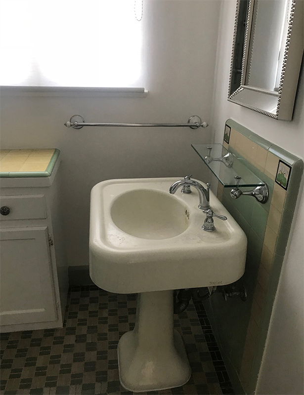
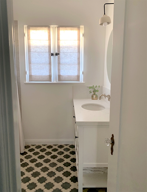
In the kids’ bathroom, we kept the original bathtub and changed all fixtures to polished nickel which has a chrome-like finish with warm undertones, typical to the era. Black hinges and knobs are all period-appropriate. The custom charcoal and white cement floor was created using Arto handmade ceramic tiles. The vanity was designed to fit the small blueprint. The sconce is from Worley’s Lighting; it’s black iron accents tie into the theme perfectly. The roman shades are made with white linen.
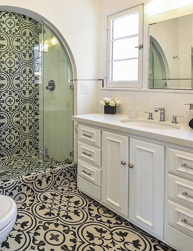
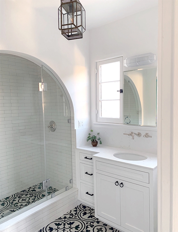
The tile in this master bath originally felt overwhelming, so it was removed from vertical surfaces, and replaced with white subway tiles for a clean, classic feel. The free-standing vanity jutted into the room, so a custom vanity was built into the space. All fixtures were changed to polished nickel, typically used during this era. The hinges and knobs are dark bronze that read warm black from Ashley Norton, and they perfectly compliment the vintage Moroccan hanging light from Kier Design.
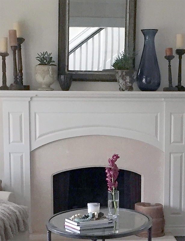
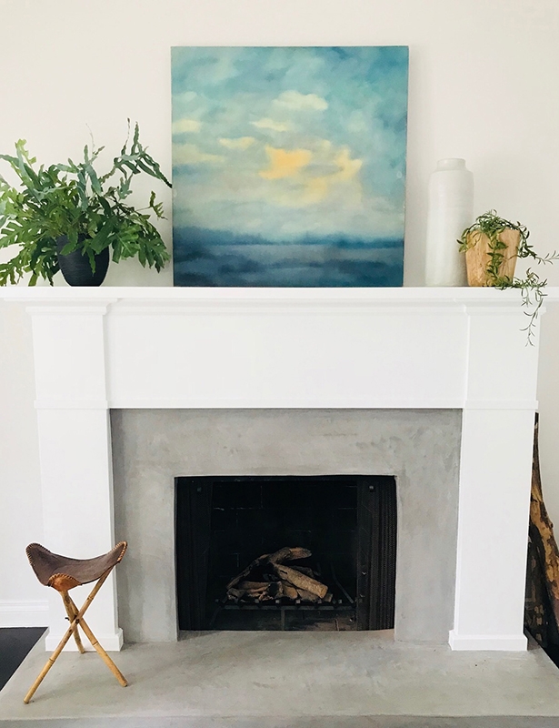
The wood mantle and the face of the fireplace were reshaped over the existing, giving the space a breath of new life without a demo and the expense that comes with it. We selected art that continues the light and airy vibe. Playful pops of blue can be found throughout the room, which is otherwise predominantly neutral in palette.
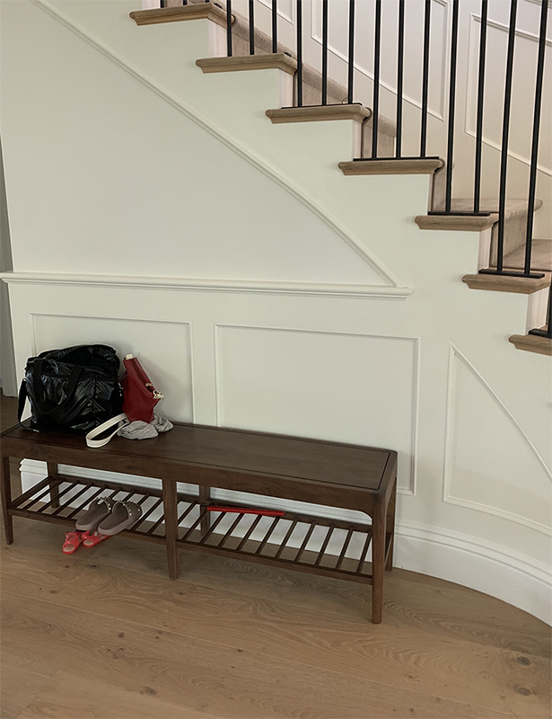
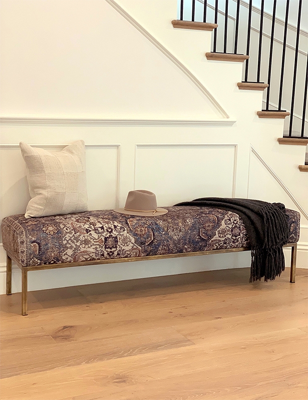
Clients are a young family with kids who needed a comfortable spot to put on shoes, but wanted an elevated look and vibe for their entryway. The custom bench base is unlacquered brass, which typically deepens in color and beauty over time. The cushion was made from a rug the clients loved. The patchwork pillow was made from vintage Belgium grainsack squares. The throw is from Shoppe Amber Interiors. Baskets can easily be added underneath for storage.
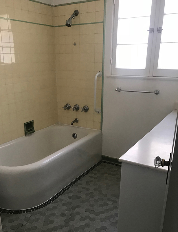
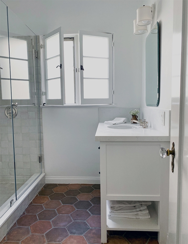
In this powder room/downstairs bathroom, we switched out the original bathtub for a shower, and used the same Arto floor tiles as the kitchen, as it’s right across the hallway. The window’s privacy glass was replaced with a higher quality option. Recessed lighting brightens up the room without a hanging light making the space too busy. And once again, we stayed true to the home’s history by using polished nickel fixtures and black hinges and knobs from Ashley Norton.
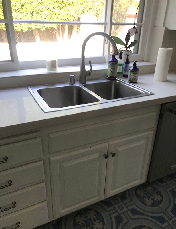
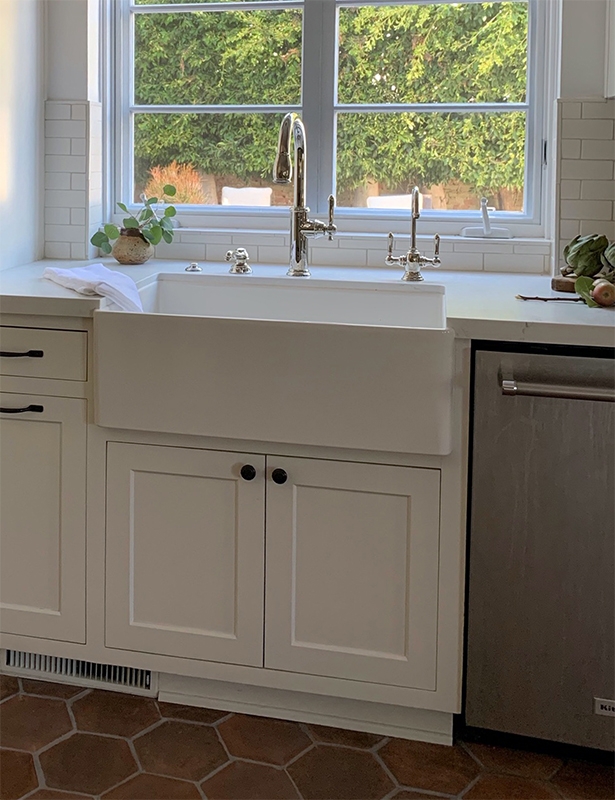
The window had to be made smaller to accommodate the fridge, greatly improving the flow of the floor-plan. A farmhouse sink was added, along with inset cabinets, and hand-cut 2×6 subway tiles from Classic Tile. The flooring is custom Arto tiles, also ordered through Classic Tile. Countertops are honed pental quartz, an extremely durable and non-staining material, and a great marble alternative.


Recent Comments